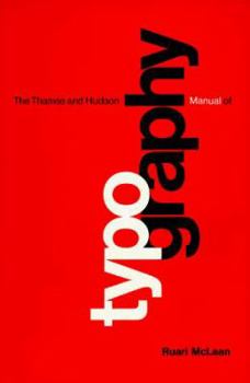
T&h Manual Typography Pa
Select Format
Select Condition 
Book Overview
Examines the use of filmsetting, hot metal, and computers in setting type and how these systems have influenced book design. This description may be from another edition of this product.
Format:Paperback
Language:English
ISBN:0500680221
ISBN13:9780500680223
Release Date:April 1992
Publisher:Thames & Hudson
Length:218 Pages
Weight:1.25 lbs.
Dimensions:0.6" x 6.2" x 9.4"
Customer Reviews
2 ratings
An enjoyable curiosity
Published by Thriftbooks.com User , 19 years ago
One or two reviews emphasised on this book as a *practical* guide to typography and found it wanting for its semi-organised style and out-of-date focus on manual typography (filmsetting, etc.). That's fair enough. I read it as someone merely *interested* in typography, and not just modern-day computer typography, but the art and science of designing pages and books *before* computers did all the hard work. From that point of view, it's a delighful book with plenty of illustrations and personal stories from the author. Some areas of knowledge are hard to convey in text, and my knowledge of printing is little improved by this book, but I'll forgive that; the essentials of design are covered very well. One's judgement of a book obviously depends on what one is seeking. For those who are merely curious or interested in historical typography, as opposed to professionally involved in modern typography, I heartily recommend "The Thames and Hudson Manual of Typography".
A practical look at typography and book production
Published by Thriftbooks.com User , 24 years ago
The book was written in 1980 before the onset of desktop publishing, and even with the additions in 1992 is in some respects a little outdated in some places. However there is a lot of practical information that is still very relevant today. Furthermore the book is well written in an easy to read style and nicely designed with wide margins that have lovely illustrations and examples of typefaces. It also makes it easy to hold the book and not have your thumb cover the text. The book starts with an historical overview of printing, then explains equipment that would have been used in a typographers studio, much of which is probably superceded by computers now. The book then examines what makes a legible publication, taking account of typefaces (serif is better for long articles), good line lengths, use of space and cultural background. Caligraphy and classification of typefaces are looked at, followed by different methods of typesetting such as hot and cold metal and filmsetting (again this is now more of a historical section). An interesting chapter on paper explains how it is made and different types that are available, the good advice to talk to your printer rather than make a choice yourself is typical of the practical information the book provides. Two chapters cover book design ranging from the parts of a book and the merits of asymmetrical or centred typography and proofers marks. McLean translated a couple of Jan Tschichold's books so is well informed on this subject and that of the golden section for determining the margins in a book. Practical considerations such as libraries often re-binding books twice and guides on margins to allow this are given here. Short chapters on jobbing typography, such as business cards, and newspaper design close the book. McLean redesigned the Observer's weekend review section in 1960 and has useful insights on design considerations.


