Romance Cover Evolution
A Look at Some of the Trends (and Some of Our Favorites!)
By Ashly Moore Sheldon • June 12, 2022
Over the past fifty years, romance cover art has changed a lot. Today's covers offer a diverse mix of illustrations and photos, from chaste to racy. In this retrospective, we reflect on some of the trends and shifts leading to where we are today.
Clinching It
 In the 1980s, the romance genre exploded in popularity, bringing with it the addition of many different categories of romance and more contemporary characters. With this boom came the iconic style of cover art that many people still associate with the genre. "Clinch covers" typically feature a brawny, bare-chested man clutching an attractively swooning damsel.
Love it or hate it, many pieces of cover art in this style are considered extraordinary works of art. Creating them was an expensive and exhaustive process. Publishers held photo shoots with models and hired artists to then render the image as a painting, adding in relevant backdrops and details. The artists who dominated this field included Elaine Duillo, Robert McGinnis, and H. Tom Hall. Of course, there was one particular figure who loomed especially large in the romance cover art from this time period.
For the Love of Fabio
Fabio Lanzoni held an outsized presence in the romance industry of the 1980s and '90s, appearing on the covers of hundreds of novels. At his peak output as a model, he was featured in sixteen covers per day! His flowing locks, anvil of a jaw, and massive, hairless chest came to represent a sort of ideal figure of masculinity for the era. Here are some of his quintessential covers we found on our shelves:



- Gentle Rogue by Joanna Lindsay: He's an irrepressible ship captain!
- The Prince of Midnight by Laura Kinsale: He's a legendary highwayman!
- Bride of the Wind by Shannon Drake: He's a disgraced lord-turned-pirate!
- Tomorrow's Dream by Peggy Hanchar: He's a savage frontiersman!
The Six-Pack Special
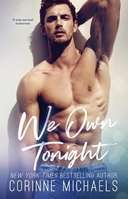 In recent years as photo art has taken the place of artists' renderings, one popular style has been coined the Magic Mike or the Six-Pack Special. These feature the hero of the story with his washboard assets on full display. Here are a few enticing examples of this cover type.
- We Own Tonight by Corrinne Michaels: When a woman finds herself having an uncharacteristic drunken one-night-stand with her celebrity crush, she flees, thinking there's no way it could work out. But he's got other ideas.
- King by T. M. Frazier: King's future hangs in the balance. Doe's is written in her past. When they come crashing together, they will have to learn that sometimes in order to hold on, you have to first let go.
- Dear Ava by Ilsa Madden-Mills: Ava was banished from her prestigious prep school by the rich and popular Sharks. So when one of them starts sending her anonymous love letters, it's the last thing she expected.
Open to Your Imagination
Another trend that took off in the 1990s was covers featuring just torsos. A shapely woman in a bodice, two bodies pressed together, ripped, glistening abs. These types of covers give the reader a chance to envision whomever they'd like to see in these scenarios—perhaps even themselves!
Diversity of Desire
 Within the white, heterosexual dominated industry, there has long been a push for more representation of multicultural and queer romances. Beverly Jenkins was one of the frontrunners in featuring Black protagonists in (and on) her romance novels. Amongst her gorgeous covers is Destiny's Embrace, a romance set in the American West. Another we love is Night Song, another fiery Western centering on an independent schoolmarm and the dashing cavalryman vying for her love.
And here are a few more covers (and authors) we love serving up cultural and sexual diversity:
- Trade Me: Bestselling author Courtney Milan has spearheaded efforts to bring more diversity and inclusion to the industry.
- Unwritten Law: Australian author Eden Finley has made a career of portraying sultry, light-hearted MM romances.
- Once Ghosted, Twice Shy: Alyssa Cole writes a huge variety of quality genre fiction and always offers diversity, both in race and relationship types. One reason we love this cover? The models fell in love on the shoot.
The New illustrated Style

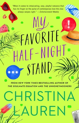 In recent years, a trend for graphic, illustrated styles have really taken off, particularly for rom-com novels. Readers may like this style because it looks a bit more reserved for things like reading at work or on public transportation. (People won't know you're reading about sex!) But whatever the reason, we're loving the results. Here are a few fun examples of this trend:
- Intercepted by Alexa Martin: We love the closeup perspective here and the shiny perfection of the details on this sporty romance.
- My Favorite Half-Night Stand by Christina Lauren: A simple, yet effective, depiction of a modern relationship.
- The Right Swipe by Alisha Rai: This adorable cover emphasizes another benefit of the illustrated cover—the ability to reflect diversity.
- One Last Stop by Casey McQuiston: We get some great information about the premise of this WW romance from this fun cover. And the placement of the title is so clever.
Contrary to the oft-uttered phrase, you really can tell a lot about the type of romance you're picking up based on the cover. We've had a blast unpacking the details of the romance cover evolution. We hope you enjoy it too!
Follow us on Facebook, Twitter, Instagram, and join our Facebook group Book Love Hub™ to connect with a community of readers like you and get daily book recommendations, literary tidbits, and more.


